5 Design Tips for Email
Email is known to be the biggest return on investment of any digital marketing channel. A bold statement, but stay with us. According to Hubspot for every $1 spent on email, $36 was made and with 37% of brands looking to increase their spend on email marketing it’s time to get savvy about how to design a commercial email.
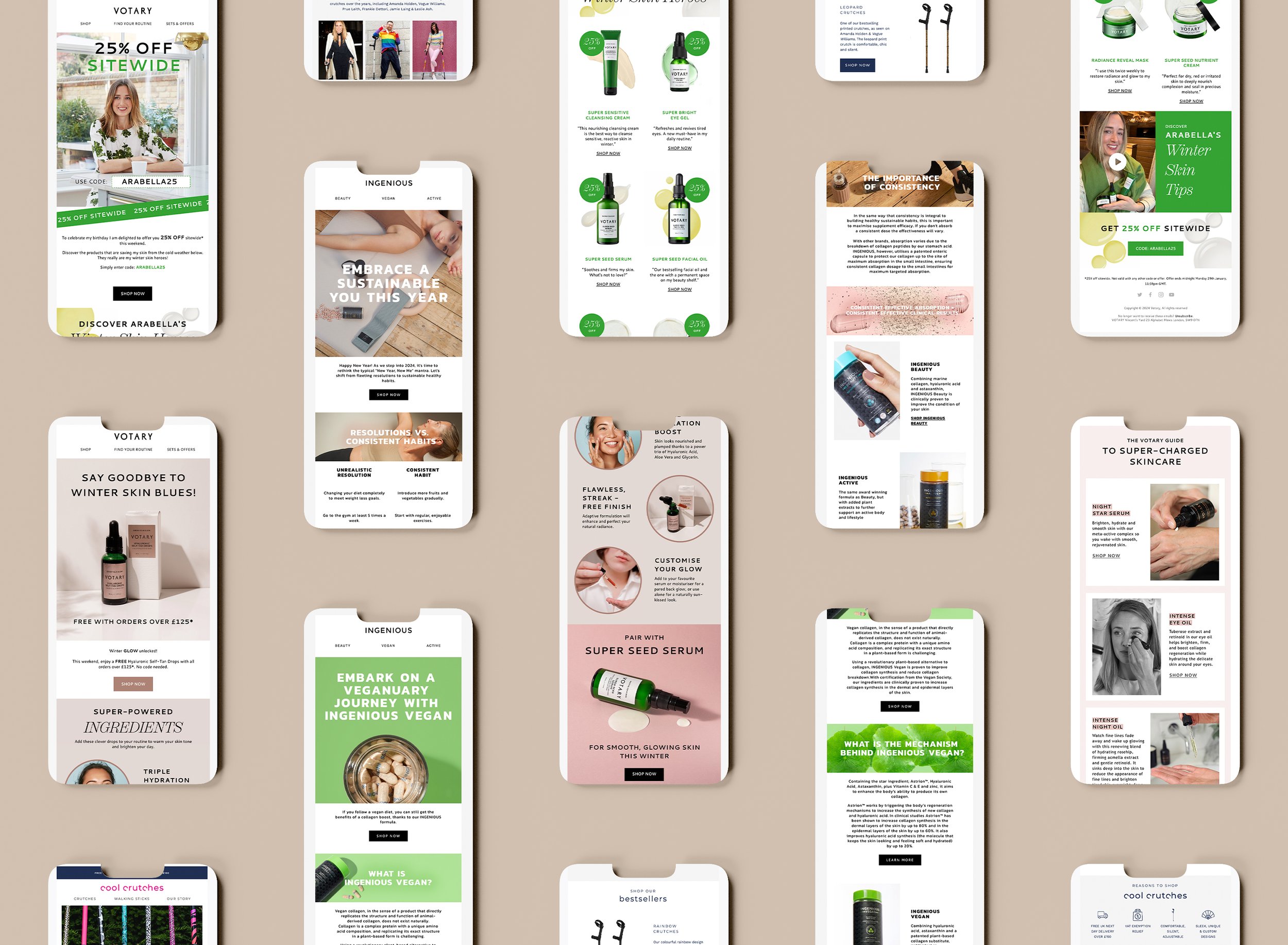
We love using Klaviyo and highly recommend it for all our eCommerce focused customers. This is because we can set up beautiful templates for our clients to use for all their automated and weekly emails, that have rows or ‘modules’ as we like to call them, that can be repeated or deleted depending on the content you want to cover.
However, if you do fancy building your own here are 5 tips to help you get started in creating effective e-commerce emails:
I want get in touch for email help!


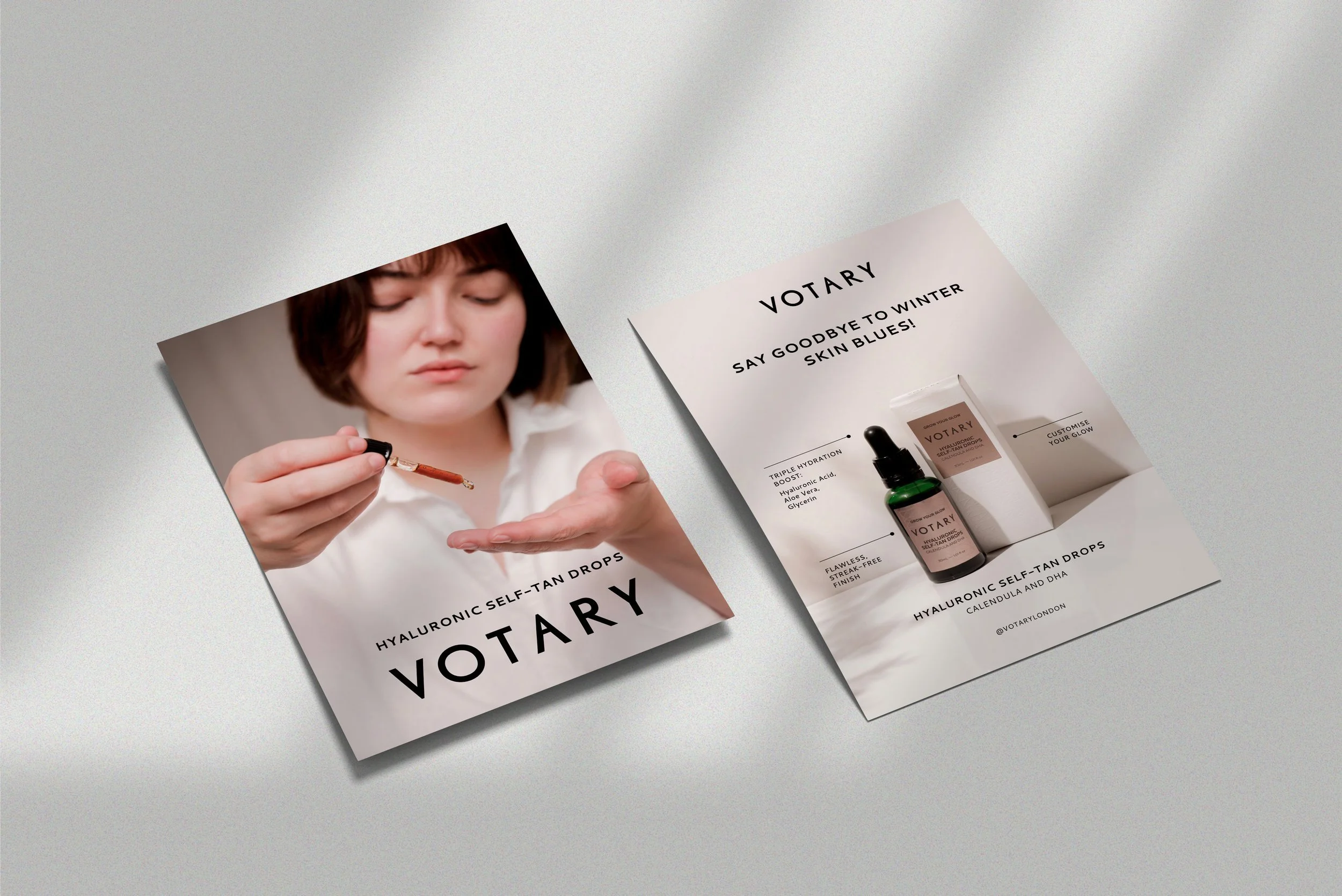
Lead with your brand
Using your logo and brand colours at the top of your email ensures your customer knows whose speaking to them within milliseconds.
Pro tip: having a navigation with links to 2 or 3 pages of your website, particularly ‘New arrivals’ are highly clicked areas of an email and make the top of your message super commercial.

2. Use live text and keep it short and sweet
Customers don’t want to read long emails, so keep your message concise and to the point. Moreover, readers need to be able to do just that, READ. Image only emails are less user friendly - especially when they don’t load - and some recipient inboxes will immediately mark them as ‘spam’. Live text is the words you type into the email that aren’t part of an image. These words will maintain a proportional size on any device, so whether you are viewing on your iPhone, Android, tablet or desktop, everything will be legible.


3. Move it, move it!
Using imagery that showcases your product or service in it’s best light is vital to a great email campaign, but elements of moving image or gif are great to amplify attention to specifics. For instance, showing your patented aspect of a product or someone using your best seller tells a story that a static image can’t.
Pro tip: keep gifs to 1MB or below for optimum loading!


4. Don’t forget the call to action (CTA)
Make sure you include a clear CTA in your email so customers know exactly what you want them to do and ensure this is placed within the first part of the design or ‘above the fold’ so that the reader can simply open the email and click through without scrolling. Don’t be afraid to repeat buttons down the email - the aim is to be commercial so we can remind our customer of what we want them to do throughout.

5. Test, test, test
Test your emails before sending them out to make sure they look good and are working properly. Make sure your email looks good on desktop and mobile. On Klaviyo you can see previews of mobile and even create bespoke layouts for the mobile version of your email using their new editor. Check buttons click through to the right places and and tracking is in place. Then, hit send!


Following these tips will help ensure that your ecommerce emails are engaging and effective. For plenty more design advice, head over to our Instagram (link) and check out our grid or slide into our DM’s to ask a burning question.
P.S. If you are looking for an email strategy wiz, especially when it comes to making money from automated emails, Hannah Spicer is your woman! Contact her here.
P.P.S. Some of our links are affiliated, which means you wont pay any more for the service but the the brand we are working with rewards us for recommending you. But we wouldn’t do that unless we had already seen great results from using them!