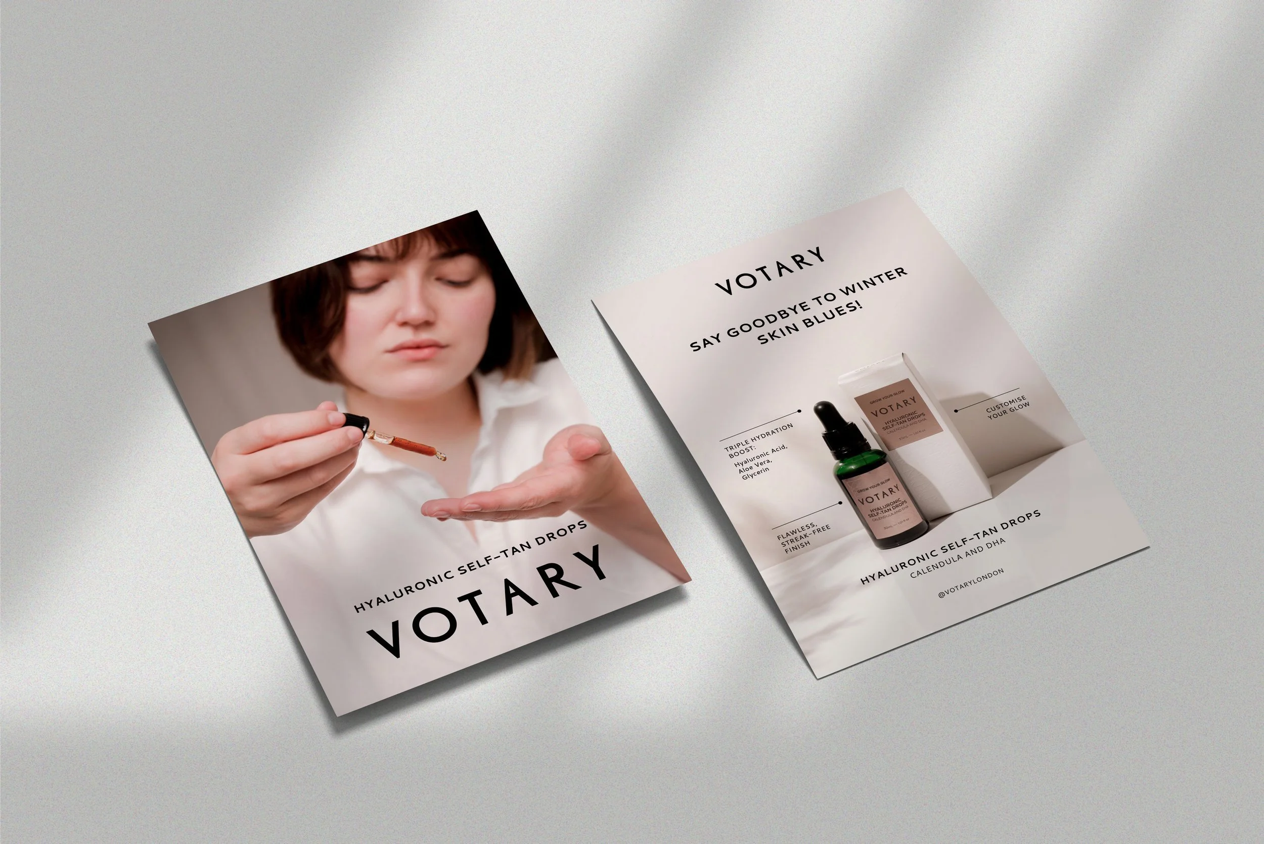
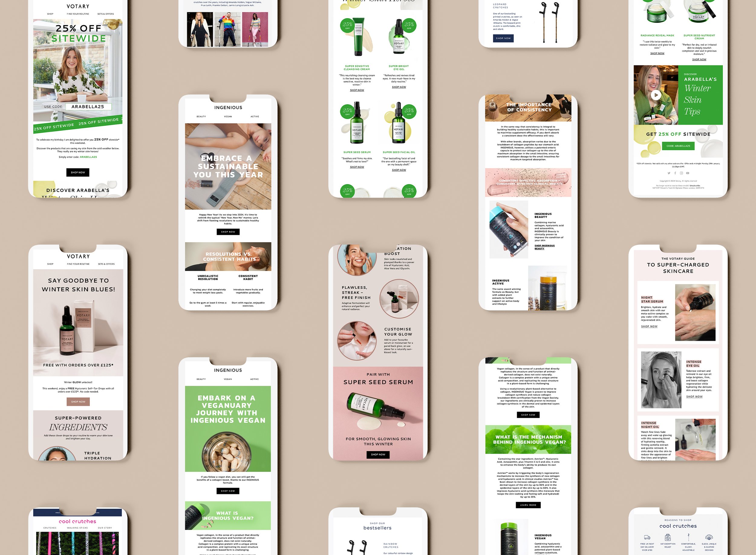
The Power of colour - ORANGE
Welcome back to the second of our new series, The Power of Colour. This year we thought it would be interesting to explore and share the powerful impact that colour can have on our emotions, behaviour and overall well-being. In the last post we explored the psychological impact of Magenta. This month, we discover how orange has cultural significance and differing psychological effects to Magenta as well as some practical applications.
Need help with design work in 2023?

ORANGE
Orange is a vibrant and cheerful colour that evokes a sense of warmth, energy and enthusiasm. It combines red, symbolising courage, strength and power, and yellow which denotes joy, optimism and happiness).
Aside from the obvious brand ‘Orange’, plenty of brands use tones of orange to amplify their brand tone and values. Psychologically, orange is believed to have a positive effect on our mood and emotions, which makes sense when you consider the symbolic means of the colours it is made from! Nickelodeon use orange for their paint splatter logo, which aims to attract the attention of a young audience who are looking for tv shows that are comical and uplifting…do you see where we are going with this?
It is thought to encourage feelings of enthusiasm and energy, and to reduce stress and anxiety. It can also help to boost self-esteem, which is why it is often used in therapy and counselling. Studies have found that people who are surrounded by orange tend to be happier and more optimistic than those who are not, so it is well suited to brands who was to evoke a cheerful and optimistic feeling to their marketing, store interiors or eCommerce website. Headspace, the mindfulness app is a great example of the use of orange within the logo purely to promote the feeling that the brand aims to deliver to its users, whilst standing out in the app store amongst its ‘relaxing blue’ competitors.


Orange is also associated with creativity and self-expression, which can be helpful for those looking to tap into their creative side. Fashion power-house Hermès, use orange to pigment their iconic gift boxes. Ironically this was by default after the second world war rather than for the psychological impact.
According to Hermès:
“This warm citrus colour, which is not listed with Pantone, became symbolic of the house after the Second World War. Its appearance goes back to 1942, when there was a shortage of cream-coloured cardboard boxes. The supplier resorted to what he had left. It happened to be orange.”
😆 sometimes our fate is in the hands of others, and we love this example of how such an iconic part of the Hermès brand came from need rather than strategy.
Overall, orange is a uplifting colour that can be used in fashion, branding and psychology to echo brand values. It's a great choice for those looking to add a sense of energy and vibrancy to their designs.